Sunday, June 27, 2010

Map improvement: 3 steps

I've started to think the reason why I stop working on my maps when they're ready for first release is that I run out of clear goals. Since lack of improvement is a bad thing, the past couple of weeks I've been trying to find a work flow that lets me state a problem in a way that makes it easier to find a solution.

Stating the problem in the first place is a good thing because then you've actually got a more specific way of determining whether you're improving the area you're working on or not. My problem has been that I've just said to myself "this is bad, it should be better" instead of trying to say exactly what is bad and how it should be made better.

The last couple of weeks I've been trying to clearly state what is a problem and why, noting down things that need to be there and working from that. The latest area I've been trying to improve have been the second story area between the first and second capture point.


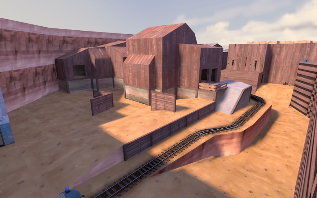
Since the second floor balcony was overlooking the first spawn point for Red, it was a bit too powerful to begin with, if Blu managed to get a Heavy+Medic team upstairs the defender reinforcements couldn't really get out of their spawn door. Rebuilding the spawn points gave Red three separate paths out of the spawn, allowing the second floor more freedom since it only blocked one of the exits.

Another issue with the first layout was that the stairs being inside the houses blocked nearly all the space, making the houses feel really cramped. Having the two houses with a bridge between them also made it look a bit too much like the buildings at Capture point 1 as well as taking up even more space.

Step 1:
make sure you have a clear goal. Writing down the problem it came out to: make the second story area bigger while keeping the sniper paths run along the sides.


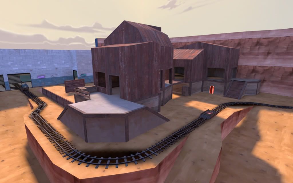
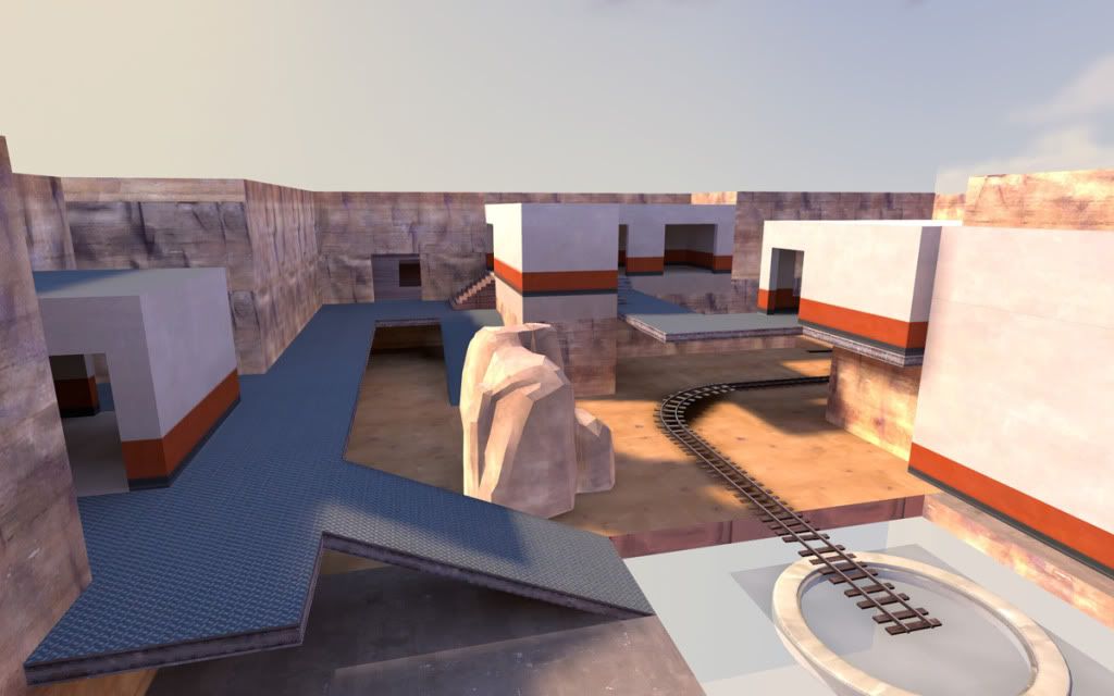
Right side showing balcony overlooking Red spawn #1

Step 2: after setting the goal, make sure you pay attention to all the limiting factors. There might actually not be a lot of them, some of them are just lazyness, continuing to build on your old houses because you already built them.

After clearing out the houses that were there to begin with and just raising the platform there was a lot of space to work with. The only necessary walls were the one blocking the stairs to the second spawn as well as a big wall mostly to block visibility for snipers.


Working from this small number of limitations there were several ways of doing the layout. The solution I finally chose has the added benefit of being able to also extend the skybox inwards to optimize visibility and keep players from seeing too much of the second area while attacking the first stage of the map. It also keeps players from standing on the right side (top in the screenshot) and sniping any of the exits from the Red spawn.

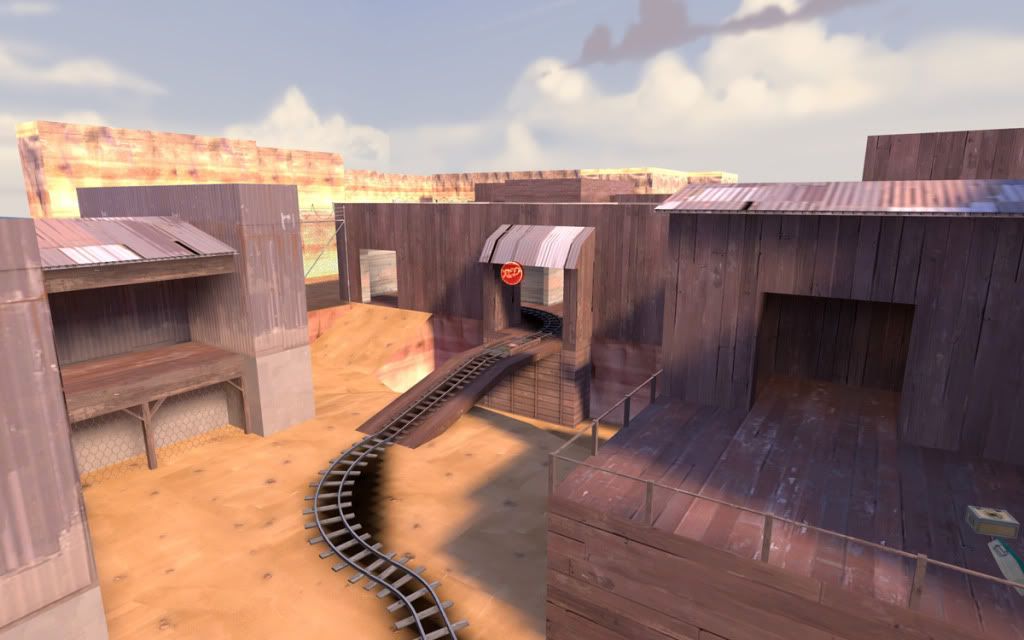
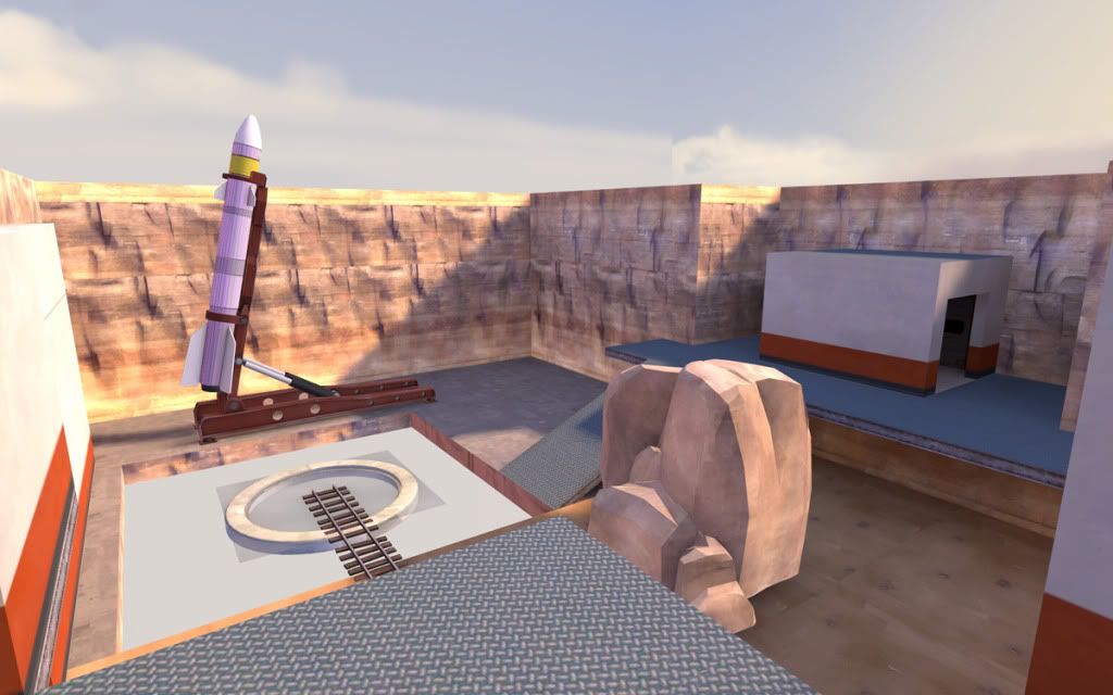
The bottom area that's been blocked off from seeing the sky feels a bit cramped instead now so I'm not sure if I need to put non-skybox lighting there or not. I think it looks pretty cool either way, with a couple of props it'll be pretty nice as well as offer more variation from stage one. If it doesn't work I'll just block it off and make the first floor of the houses have a way through since it's currently entirely empty.

Step 3: test it to see if you've lived up to your goal. I thought of putting this first but there'd be nothing to test if you didn't build it first so having it last applies to the first case as well as the last.


I haven't really decided if this is the way to work in every case but right now it feels good. I haven't been doing too much mapping on occasion of the holiday keeping me busy with work (that I get paid for) but hopefully it'll pick up over the summer. Here's to hoping and writing down clearer goals.
Click for full post

Wednesday, June 16, 2010

Mini-review: The Whispered World

A couple of weeks back, I bought The Whispered World (WW) mostly based on its graphic style. I like the hand-drawn look, in fact the game I'm currently playing is Valkyria Chronicles on the PS3.

The game is presented as being "In classic point and click tradition" which is actually an understatement. It's exactly like an old point and click game like King's Quest and not at all like an old game like The Dig. The difference between those games are in my own opinion mostly that in one of them the puzzles mostly make sense and in the other they require you to spend hours in your inventory using item X with item Y and seeing if it will work.

There is a difference between doing something in the style of old games, ie. hand-drawn backgrounds and doing something just like old games and unfortunately WW falls into the wrong category.

While I'm talking about a lot of weak points there are some positives as well. The best one is Spot, your weird worm companion. He follows you around and as the game progresses you'll be able to transform him into different forms, using him to solve puzzles. While this acts as another thing to try to rub against everything, he's also really cute and it's an interesting mechanic that shows it's learned something from the 20+ years of adventure games.

Another thing is the space bar button that highlights all the items on the screen that you can interact with. The reason why this is not entirely a good thing is that you can't actually find out that there is such a button because there is no "controls" tab in the and there is no game manual. I only found it out by accidentally hitting it. Turning the controls into a mini-game of "press every key hoping it does something" is not quite good game design.

I want to like the game, I really do. It's just a bit too much pretty graphics and annoying voice acting. Having a couple of guys working in the design department that actually wants to do something about usability would probably help the game a lot. I can't believe some of the puzzles actually got through the testing phase unchanged. I ran into a couple of spots where using one item on another made Sadwick say "That's a great idea" (or something like it) and still not doing anything because it was missing some component. If it's a great idea, I want you to do it, otherwise I want feedback telling me why it doesn't work.

While WW is a nice game that will take a few hours and has some nice puzzles, I'd still recommend you getting a Sam & Max pack instead. It's around the same price and you'll get 24 episodes with 2-3 hours of play time with puzzles that make more sense. If you want an old game that is excellent and cheap, get The Dig.
Click for full post

Tuesday, June 15, 2010

If at first you don't succeed

So I made a first release of my map for last week. Unfortunately it didn't do so well, in my own opinion mostly based on the spawn points. Not so much that they didn't do their job but more because the spawns and the paths leading away from them weren't really as intuitive as they should be.

I was hoping that avoiding signs would force me to make it better and better until everyone understood where to go, then when I add the signs it should be perfectly clear. It seems to work so far, since I've changed three out of four spawnpoints for the second release of the map.

Spawn #1
The first spawn had a problem that was really easy to fix since it mostly relied on moving it back to where respawning players had vision to the first capture point. This shouldn't really have made it into even the first alpha release since I was aware of the problem already. Guess I was just so happy that I finally got all the entities working that I wanted to playtest immediately. Moving it back a couple of hundred units as well as up the stairs.

I'm still considering moving it back a bit more into the house upstairs but I'm also a bit concerned with the sniper vision, currently fixed by a couple of crates being in the way. I want to test this location properly then if it doesn't work I'll just rework the entire corner to remove vision from the first capture point.

Spawn #2
While the first spawn was easy, the second one was trickier. It is used for RED to defend stage 2 and for BLU to attack the final stage and since it's used for both teams it needs to be easily accessible for both. I just didn't manage to do it with any of my solutions using the same spawn points for both players so I went with a single spawn room with separate spawn locations instead.

Before- and afterimage.


Spawn #3
The last spawnroom is only used for RED defending the last 2 capture points and it's working great for the very last point, not so much for the third one. My first solution just had a rather narrow walkway doing a ninety degree turn which most players ignored and just jumped down instead.

I've tried both making the area more open to be inviting as well as making it a straighter route from the spawnroom to the point so we'll see how it works out.

The map is not done yet but it's improving. I actually woke up yesterday having dreamed about mapping so I think I'll be taking a couple of days off.
Click for full post

Sunday, June 6, 2010

pl_shaft alpha 1 released

I think that my map is fully functional and playable and have done tests with low numbers of players. The spawn rooms and captures are working, there are no development textures and a bit of optimization.

It's not pretty but it's playable. Finding 15 good testers is another thing entirely. If my own server is up and running, you can find it at 83.176.206.248 and come join us. You can also add me as a steam friend "Huckle" (with the question mark heart) and ask when it's coming up.

Map can be downloaded here, via rapidshare. Click for full post

A life-changing moment?

First of all, this will only be indirectly about game design. I watched a speech for the second time and this time it actually made me better at doing what I do. Not in the way that I understand something better but that I constantly have a demon in my head saying "is this really what you should be doing?". As soon as I open up a firefox window, answer private messages or make playlists in spotify it comes back and that's a good thing.

While I don't have the minor gift of talent, I do have the love for what I do and I'm constantly thinking about how to make my work better. With the added bonus of actually putting in the hours of work, I can't help but think that eventually I'll be an awesome mapper. It might not show yet but wait a couple of months and keep your eyes on this page. I'm going to be one of the people who ship.

The speech: Seth Godin: Quieting the Lizard Brain, try it out for yourselves.

For the last week I've gotten so much done and it feels great. If this lasts until my 30th birthday I'll get a hold of this guy. Not so much because of what he's done for me but because of what he made me do to myself. Click for full post

Thursday, June 3, 2010

Current mapping project: pl_shaft

Here it is, my current mapping project. It's a single stage payload map (like badwater basin). I've made some good progress the last couple of weeks after my trip to LA and I might be able to get a functional alpha out for game testing this weekend. It's currently fully functional even though I have some issues with the spawn doors.

It looks like crap though and doesn't have any displacements. It's not supposed to, it's an alpha test, I expect to change everything quite a bit. The only part of the map that's actually been tested is step one, it's also the only part that has any kind of details and houses that have roofs. Detailing is meditative, it's where I go when I'm too tired to think of how to continue.

Pictures after the jump.


Capture point #1, facing forward

Capture point #1, facing back

Capture point #2

Capture point #3, facing back

Capture point #4, facing back

Capture point #4, facing forward

Click for full post